
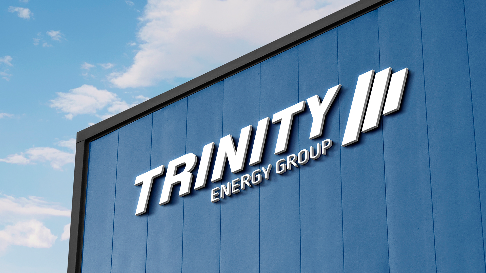
Rebranding while retaining what matters most.
With continued growth and evolution, Trinity Energy Group needed a brand that could stretch across their many specialty services. The refreshed identity was built with flexibility in mind, covering their current needs while leaving room to grow and adapt into the future. This rebrand and related projects were completed in collaboration with New Brooklyn Media.

A Thorough and Thoughtful Rebrand
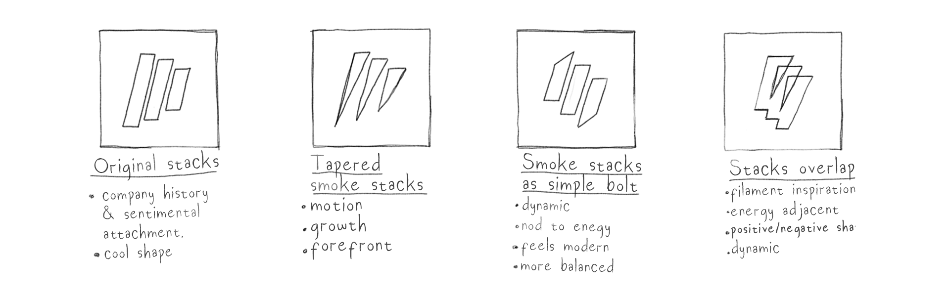
This project was always a rebrand, but preserving Trinity’s history mattered. We explored many ways to reimagine their original “smokestack” logo, but its significance was too strong to discard. Instead, it became an anchor for the new identity, merging the tried and true with a modern, polished look that honors their roots.
Fleet Wrap Design
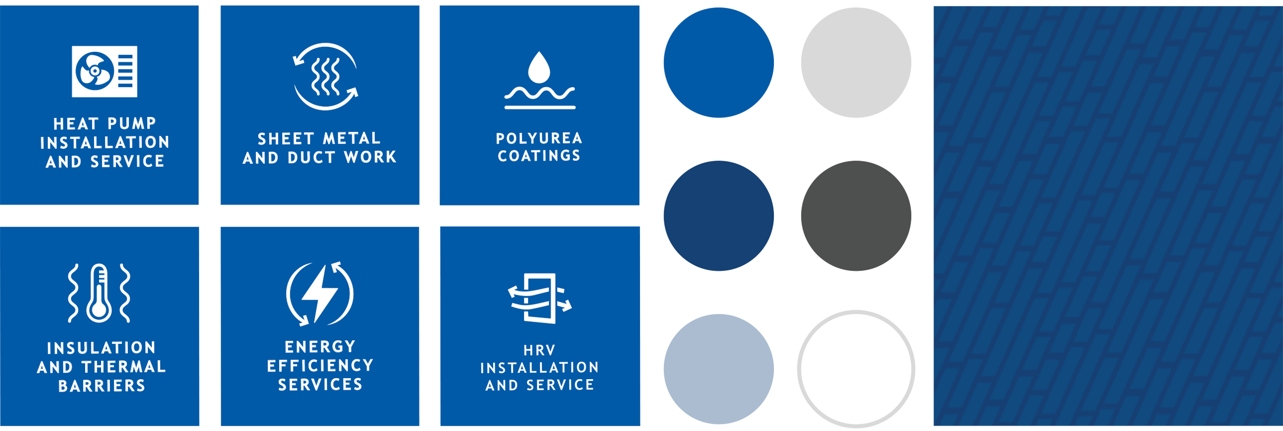
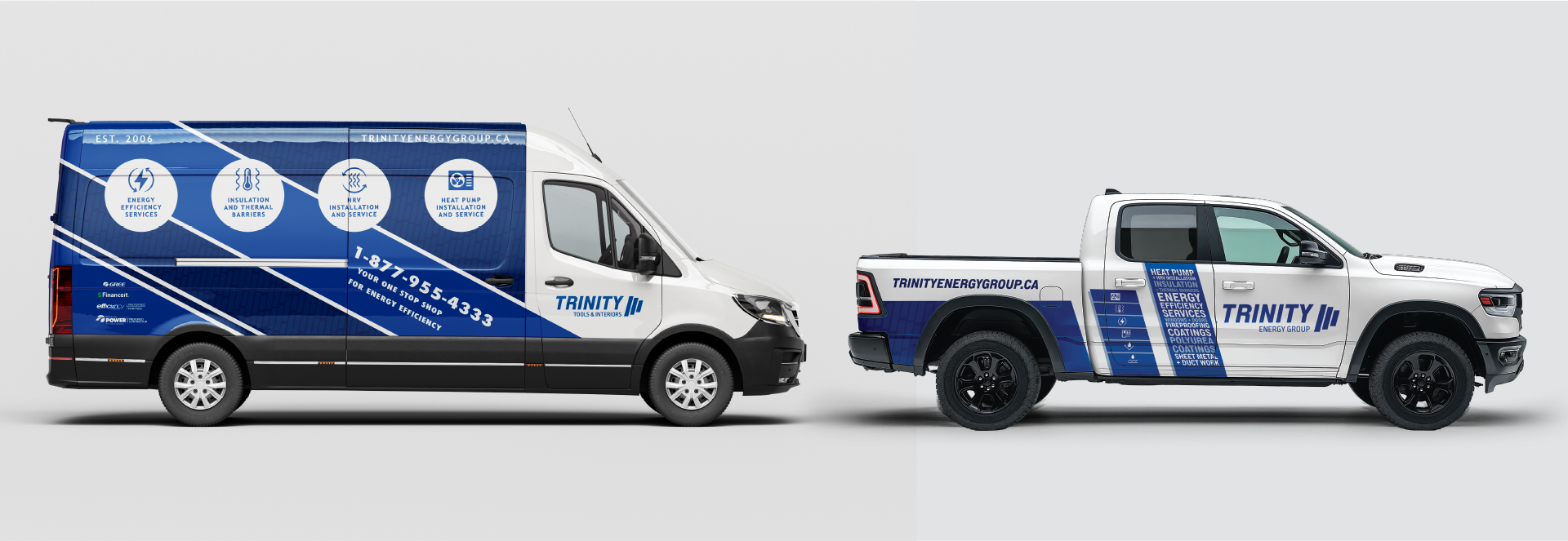
Operating across Atlantic Canada with 125 vehicles on the road at any given time, Trinity needed a cohesive fleet design that was professional, flexible, and scalable. Our brand guide introduced a fresh color system, custom pattern, and an ever-growing icon library that allows each division to stand apart while still maintaining the strength and unity of a single brand. We work closely with AutoTrim & Signs New Glasgow for all printing and installation needs.
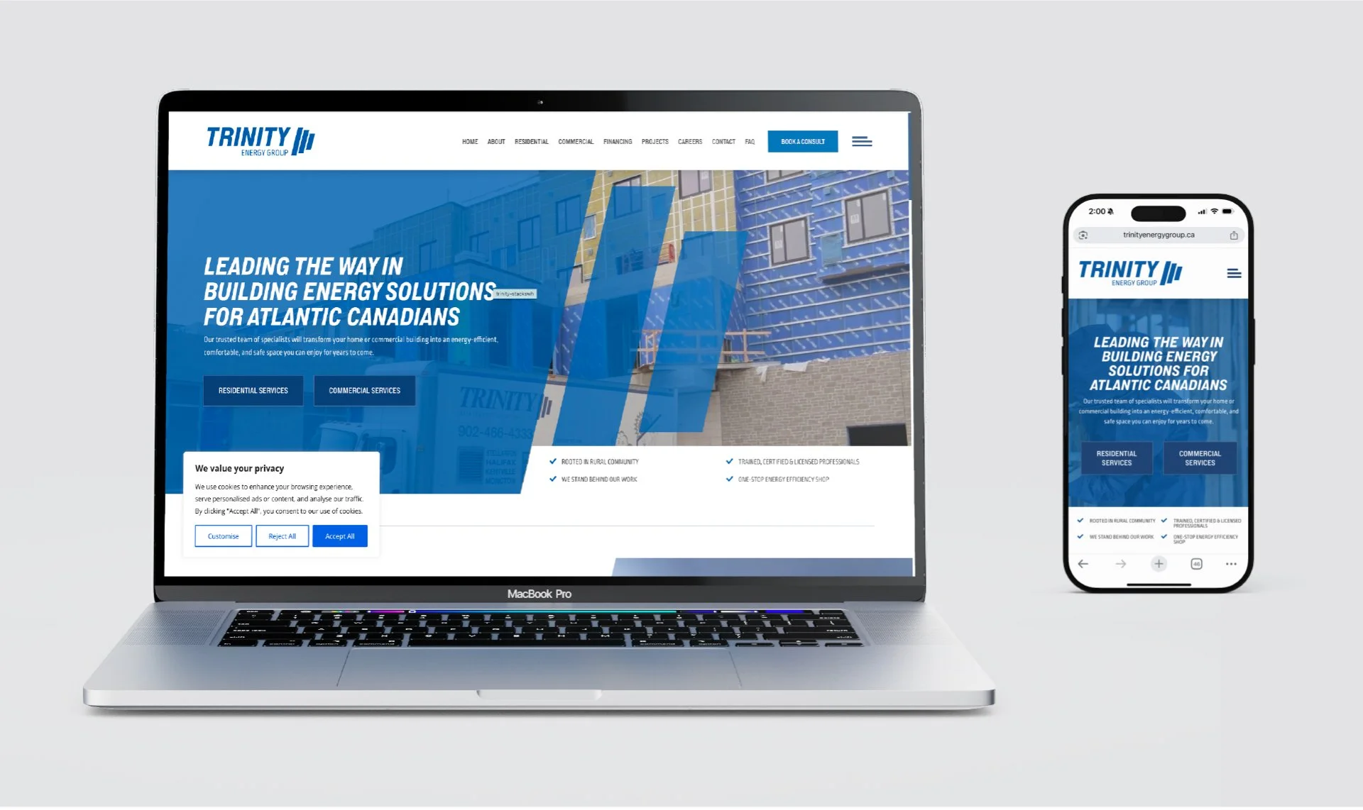
Website Design & Development in Partnership with Maritime Design
In partnership with Maritime Design, we developed a clean, user-friendly website that highlights Trinity’s technical expertise, brand partnerships, and sister companies. The site creates a streamlined experience by clearly separating residential and commercial services, helping customers quickly find what they need.
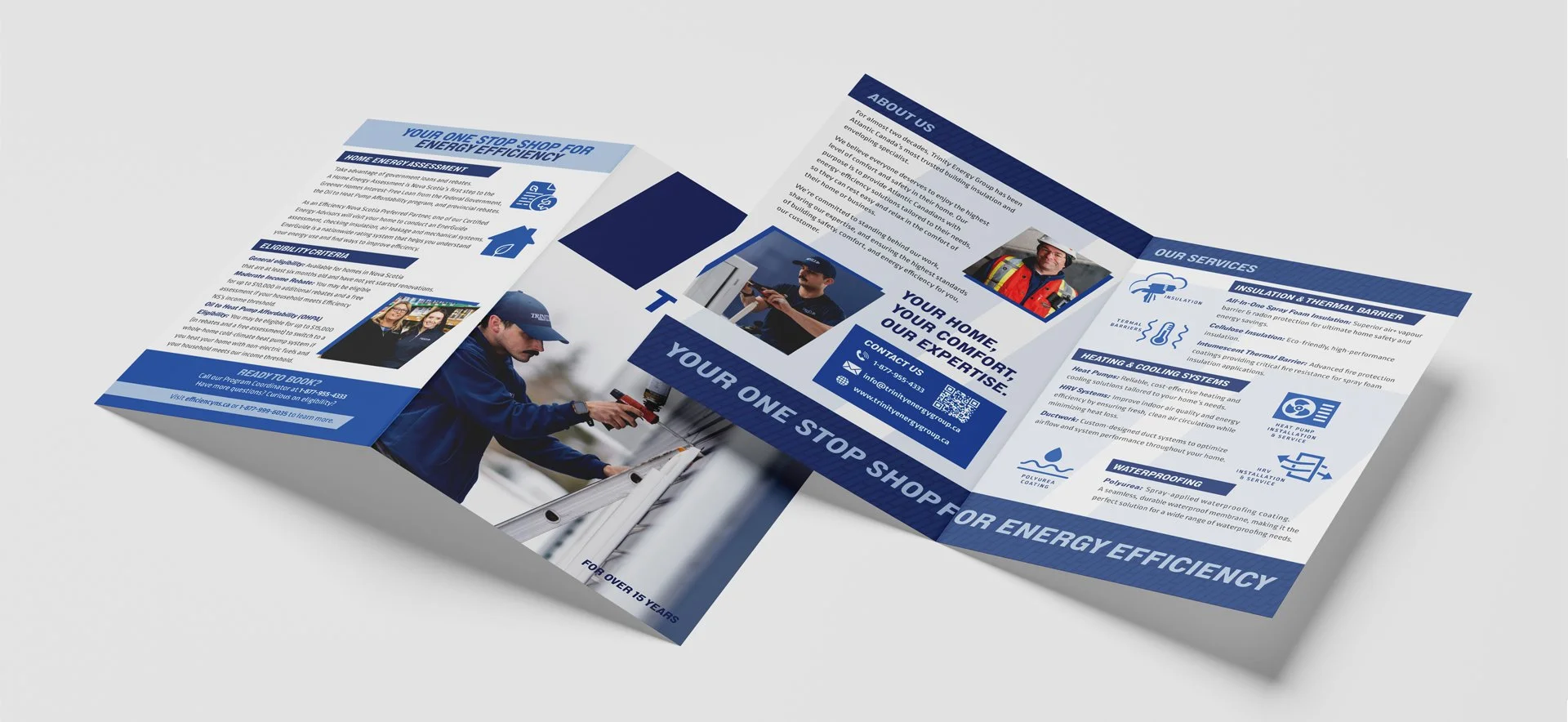
Print & Collateral
From brochures to trade show materials, we continue to design print media that mirrors Trinity’s brand voice and visual identity. The materials clearly communicate their mission and services while being versatile enough to support both customer inquiries and quoting situations.